Food & Beverage
Tropicana’s New Design: Embracing Heritage with a Modern Flair

- Tropicana’s 2024 rebrand restores its iconic orange and straw imagery, updating the design with vibrant colors and a modern font.
- The refresh pays homage to the brand’s 1947 heritage while learning from the controversial 2009 redesign that led to significant backlash.
- By blending nostalgic elements with contemporary aesthetics, Tropicana aims to reinforce its market position and appeal to both loyal and new customers.
Tropicana‘s current redesign is a refreshing tribute to nostalgia, with vivid imagery evoking childhood breakfast memories. The new design, produced by the U.K. agency Sunhouse, stands in stark contrast to the previous 2009 makeover, which was heavily criticized and eventually canceled. This current makeover tries to revitalize the legendary orange juice brand while remaining faithful to its origins.
Stepping Back to Iconic Images
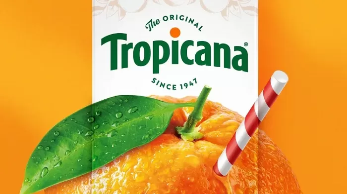
The Tropicana logo has been rejuvenated for the 2024 makeover, returning the original motif of an orange punctured by a straw. This core emblem, complete with a drop of juice, shows the brand’s dedication to purity and natural goodness. The Tropicana wordmark has also been somewhat modified in the design, with an arch and a whimsical orange dot above the “i.” The choice of Brother 1816 typeface, with its handmade finish, adds to the brand’s authenticity.
The redesigned package emphasizes Tropicana’s legacy, with the words “The Original Since 1947” around the logo. This addition not only honors the brand’s rich history, but also strengthens its status as a juice industry pioneer.
Learning from the Past
Tropicana’s rebranding efforts in 2009 were widely criticized. The previous design, which simplified the emblem and eliminated the characteristic orange and straw, was criticized for being generic and uninspired. This error reportedly cost Tropicana over $50 million and resulted in a 20% decline in sales. In response to consumer complaints, the brand soon returned to its old packaging.
Tropicana’s 2024 redesign demonstrates that it has learned from this experience. The new design preserves cherished aspects while introducing subtle but significant modifications. The reappearance of the orange cap, a popular feature from the 2009 makeover, adds a whimsical touch while reinforcing the brand’s dedication to quality.
Embracing Nostalgia and Modern Appeal
Sunhouse Creative’s revamp updates Tropicana’s vintage themes. The new packaging jumps out on shelves and connects with customers because of its use of bold colors and hand-drawn drawings. The emphasis on orange and straw imagery, combined with a fresh and inviting color palette, distinguishes Tropicana as both a timeless classic and a current pick.
The makeover also addresses previous criticisms by retaining the brand’s primary visual identity while upgrading it for the current market. This balanced strategy seeks to capture the essence of Tropicana’s past while appealing to a new generation of customers.


