The Basics of Candlesticks & Their Charts

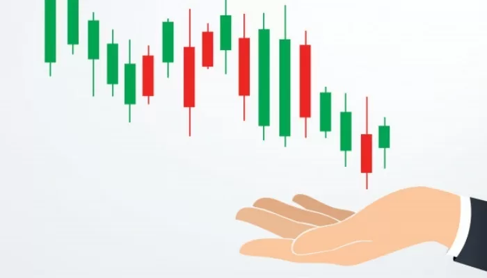
A current financial candlestick is a form of price and technical chart analysis used by traders that displays the high, low, open, and closing prices of a security or instrument over a specific period. Sometimes colloquially known as “Japanese candlesticks”, the name originated from Japanese rice traders who used similar methods to track market prices and daily momentum of rice and other goods hundreds of years before becoming popularized in modern-day markets. Typically colored or filled in, these types of charts’ goal is to tell investors whether the closing price of an asset was higher or lower than its opening price.
Candlestick Anatomy
Typically, candlesticks show four market price points that most traders find helpful:
- Open – Highest point of The Body
- Close – The lowest point of The Body
- High – The Wick
- Low – The Tail
The candlestick’s body (sometimes referred to as “The Shadow”) considers an asset’s overall high and low prices compared to its opening and closing price. This relationship determines the candlestick’s shape and color. Green (sometimes white) candlesticks indicate there is strong buying or bullish price pressure. Conversely, red (occasionally black) candlesticks suggest there is significant selling or bearish pressure. They adequately comprise a multitude of information regarding the market’s impact on security prices. Additionally, candlesticks are used to analyze any trading periods, including minute-long, daily, or hourly cycles. Overall, they determine when to enter and exit trades of many liquid financial assets, such as but not limited to stocks, foreign exchange, and futures. More information about the basics of trading is available at the trading academy.
How to Read Candlestick Charts
Candlestick price charts allow traders to keep track of their position’s value in the market and check how prices have changed over a certain period, thereby giving clues about future price fluctuations. These charts are comprised of the x and y-axis. The x-axis reflects the time, while the y-axis shows the price. As each candlestick represents a certain segment in time, they, therefore, summarize all the trades made during that timeframe. As each candlestick is composed of four price points, each one represents different trading prices. The opening price refers to the first trade made, while the closing price refers to the last trade within that timeframe. These price points comprise the candlestick’s body. On the other hand, the wick and tail refer to the highest and lowest trading price available in the selected timeframe.
The first example below depicts a bullish candlestick (green) over the timeframe of one hour on Gold USD pairing (XAUUSD). The price started at 1,887.80 yet ultimately rose, closing at 1,893.887. However, during this hour, the lowest price dropped to 1,887.256, and the highest it reached was 1,895.233. Opposingly, the second example portrays a bearish candlestick over one hour on Gold USD pairing. The price started at 1,881.84 yet dropped, closing at 1,877.50. During this timeframe, the highest it rose was to 1,882.88 yet dropped to over 1,874.24.
You can find free educational material about the basics of trading at the LegacyFX Academy.


