Reports and Insights
Learn Your Brand History: Microsoft’s logos was rockin’ in the 80s

In the 80s
Microsoft was a lot less ‘software company’ and more ‘metal band’ from 1980 – 1982. Not many people know this, but Microsoft was a metal band from 1980–1982.
All are companies that started small, grew big, and had to wrestle painfully with their own identity along the way.
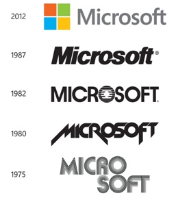
In 1980, Microsoft took a bold step with a logo redesign that left it looking much more like a wild metal band than a reliable, respectable tech company. Sadly, this look only lasted two years. But it expressed an undeniable energetic force of a startup – sweat, speed, vision, creativity and passion. They were a band of fearless rebels out to change the industry. This brand identity isn’t only a visual expression about their brand story and history, but it’s an essence that they can always tap into again to rediscover themselves.
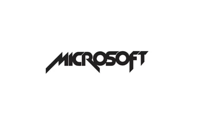
Microsoft’s 1980-1982 logo (Image credit: Microsoft)
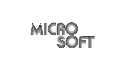
During that whole period, Microsoft seems to have been embracing a band logo design aesthetic – the 1975 logo is an impressively ‘disco’ effort too.
A brand’s logo is one of the most important things to get right. How do you distill the entire identity of a company into one simple symbol? And then, when things go stale, how do you find a new look that your loyal fans and customers will notice, embrace and love while finding it meaningful?
The whole process is a tricky balancing act. It’s so surprising to discover that Microsoft took such bold and daring steps and missteps in its branding history.
It’s now one of the world’s most popular brands with a brand logo that is considered to be one of the best in the world. Here’s what it looks like now:
Let’s say that back in the day, Microsoft clearly wasn’t afraid of embracing a confident new look. But more importantly, they never forgot who they were and what got them to become the third trillion-dollar company in the world in 2019. When you misstep, it’s OK, go back and rediscover who you are – your history. (Let’s take what’s happening to Facebook and Uber who don’t have a brand history to fall back on when a crisis hits.)
Lastly, we love this recent 2019 quote from Satya Nadella – Microsoft CEO
‘Oh we must be very good. Look at us and look at our market cap. And that’s always the beginning of the end: when you start to somehow thinking that you are God’s gift to mankind and you aren’t grounded in what initially drove your success.’
Here’s a look at Microsoft’s logo evolution over its historical and respected rise as one of the world’s top technology brands. You see each change was bold and daring. Risk-taking is evident.
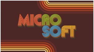
The tech behemoth turned 46 on April 4, 1975, and as a nod to its heritage, it dug up a gem from its archives—its first-ever logo—and rebooted it as its new social media profile photo and banner.
The revamped logo is a throwback to the 1970s on steroids. It sports Microsoft’s original, funky wordmark against a brown background and a five-tone rainbow. And to tie past and present, the logo is washed in Windows’ iconic colors.
Never forget your roots that connect you to your future. The best brands have adhered to this rule: History matters! That’s true for brands like Apple, Nike and so on. Learning the brand history isn’t a requirement, but people aren’t fully aware that these companies have been doing this for a long time, and that’s how they reach incredible market valuations as love brands. You don’t get there by not learning your brand history and creating your brand story that then gets infused and expressed in your brand identity.

Peter Christopher Lau, Amadeus, Head of Global Brand Experience Design


